Physical Inactivity is one of the measures health agency’s use in factoring a demographics overall wellness. The County Health Rankings & Roadmaps tracks numerous measures on a county basis, including physical inactivity. The CHRR data is for the percentage of adults aged 20 and over reporting no leisure-time physical activity. What are the health consequences of being […]
082216: Crime stats for Louisville, KY by Zip Code 2016
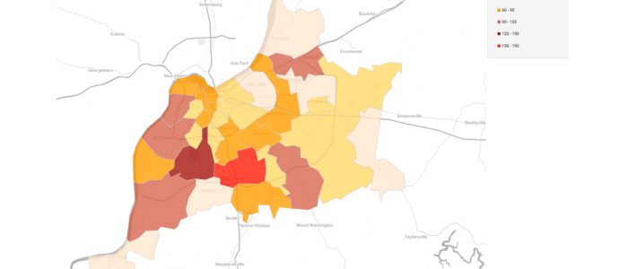
We found a dataset on Data.gov pertaining to the number of arrests made by the LMPD in Louisville, KY for the first half of 2016. When turned into a data visualization, that data showed an unmistakable trend: for virtually every crime type (assault, homicide, larceny, etc.), the heaviest concentration of arrests occurred in ZIP codes west […]
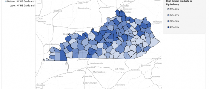
MOTD: 081716 KY High School Grad or Equivalent with Location of Selected Community College Campuses
FactLook was asked by a client in the higher education field to create a data visualization displaying the geographic distribution of individuals in Kentucky possessing a high school diploma or the equivalent. We mapped those values by county using data found through the US Census Bureau’s American FactFinder. We then plotted the location of several community […]
MOTD: 071516 Housing Units by Census Tract and Location of Natural Springs
We used FactLook to create this visualization that displays two datasets: the Total Housing Units by Census Tract; and the location of natural springs in Jefferson County, Kentucky. Using data from the US Census Bureau’s American FactFinder, we created a layer displaying the total housing units by census tract. We then used the latitude and longitude […]
Step-by-step: Building a simple county map with a single metric – Part 1
In this step-by-step tutorial, we’ll show you how to create a basic area-based map using a single metric. For this example, we’ll be building a map that has data for all counties in the state of Kentucky. The steps presented would be the same for any of the other area-map choices FactLook offers. Above is the finished […]
County Map with Geocoding
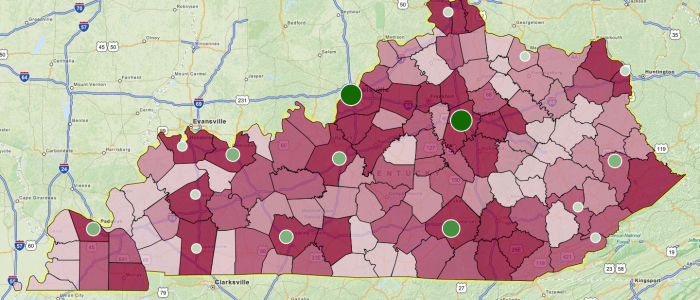
This map was created to show the unemployment rate by county in Kentucky with geocoded locations of several community colleges displaying enrollment rates. Map was used to display correlation between unemployment and location of affordable schools.