This map displays two county-level metrics for the state of Washington: median household income (blue shades) and the percentage of the population 18+ who are Veterans (red shade dots). We chose to use FactLook’s geocoding feature (Location: Street Address) to place markers at each county’s courthouse address and tied the population percentage data to these markers. The […]
Step-by-step: Building a simple county map with a single metric – Part2
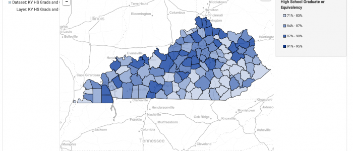
In a previous tutorial, we showed how to build a county-based map with a single metric in FactLook. In this tutorial, we’ll adjust some of the styles to create a more visually compelling thematic map. Specifically, we’ll adjust: Changing the number of breaks Using the color palette to assign unique colors to each break Displaying decimal […]
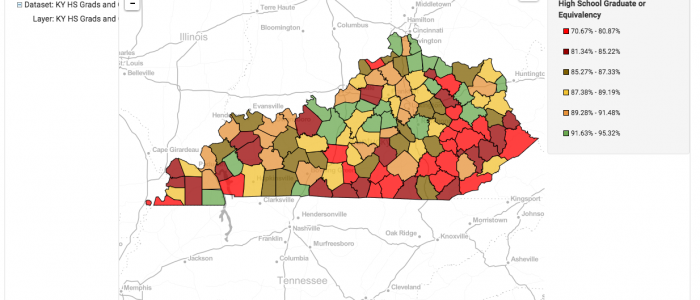
Step-by-step: Building a simple county map with a single metric – Part 1
In this step-by-step tutorial, we’ll show you how to create a basic area-based map using a single metric. For this example, we’ll be building a map that has data for all counties in the state of Kentucky. The steps presented would be the same for any of the other area-map choices FactLook offers. Above is the finished […]
County map using bar chart to display income, sales and population demos
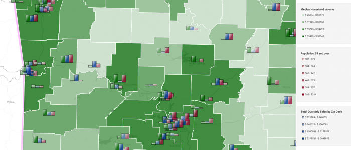
Arkansas map, showing median household income by county (green shading). Then the multiple-metric bar chart markers are showing grocery category sales for each store of a fictional retail chain along with population 65 years and older. The bar charts display a single metric (overall grocery sales) vs multiple-metric for individual category sales. The height of […]
Multi-State County Map with Geocoding and Bar Chart
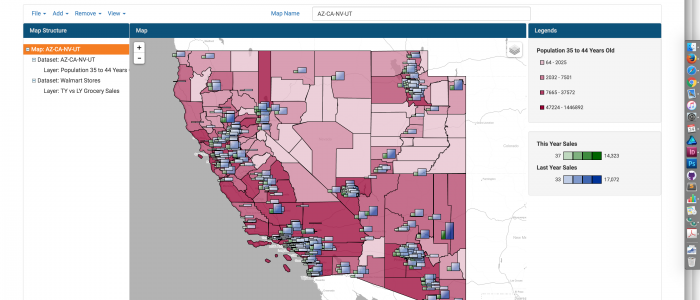
This multi-state map was created to display multiple metrics using FactLook’s bar chart feature.