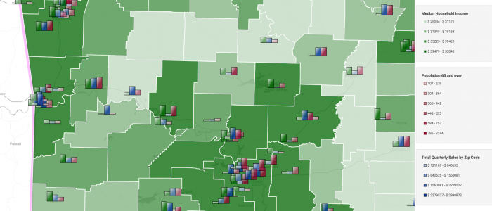
Arkansas map, showing median household income by county (green shading). Then the multiple-metric bar chart markers are showing grocery category sales for each store of a fictional retail chain along with population 65 years and older. The bar charts display a single metric (overall grocery sales) vs multiple-metric for individual category sales. The height of each bar in the bar chart helps quickly illustrate the relationships between the values being displayed.
County map using bar chart to display income, sales and population demos