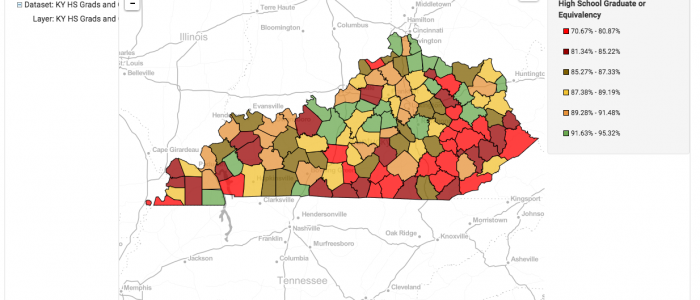
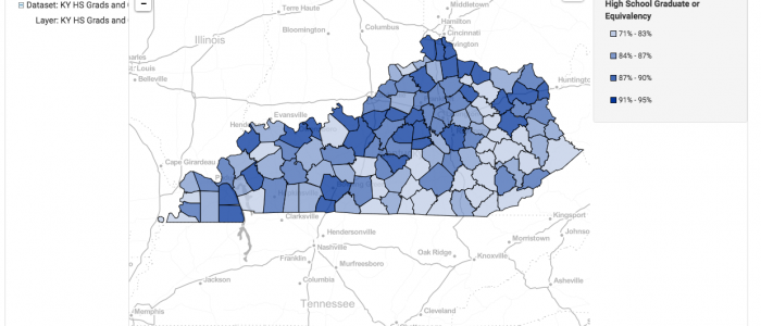
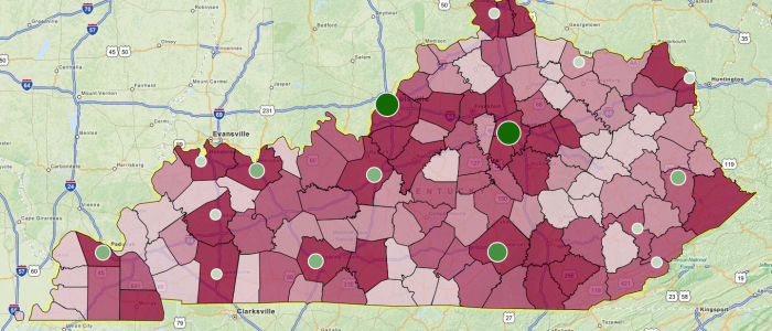
In a previous tutorial, we showed how to build a county-based map with a single metric in FactLook. In this tutorial, we’ll adjust some of the styles to create a more visually compelling thematic map. Specifically, we’ll adjust: Changing the number of breaks Using the color palette to assign unique colors to each break Displaying decimal […]
Step-by-step: Building a simple county map with a single metric – Part 1
In this step-by-step tutorial, we’ll show you how to create a basic area-based map using a single metric. For this example, we’ll be building a map that has data for all counties in the state of Kentucky. The steps presented would be the same for any of the other area-map choices FactLook offers. Above is the finished […]
Step-by-step: building a multi-metric map with geocoded locations
FactLook gives you the capability to assign multiple metric values to a single geocoded location which are then displayed on a map as fully-customizable bar charts. 1. Format your spreadsheet: Format your spreadsheet in the same manner as when using FactLook’s geocoding feature. In addition to the required columns of data, you’ll want […]
Multi-State County Map with Geocoding and Bar Chart
This multi-state map was created to display multiple metrics using FactLook’s bar chart feature.
County Map with Geocoding
This map was created to show the unemployment rate by county in Kentucky with geocoded locations of several community colleges displaying enrollment rates. Map was used to display correlation between unemployment and location of affordable schools.