FactLook gives you the capability to assign multiple metric values to a single geocoded location which are then displayed on a map as fully-customizable bar charts.
1. Format your spreadsheet:
Format your spreadsheet in the same manner as when using FactLook’s geocoding feature. In addition to the required columns of data, you’ll want to include columns of the additional metric values to be associated with each marker.
- A unique Key Field ID (this is assigned to each marker when placed on the map)
- Street Address (for location)
- City (for location)
- State (for location)
- ZIP code (for location)
- Initial metric value (assigned to each marker, required for determining data break calculation)
- Additional metric value(s) (the additional data you wish to associate with each marker)
Be sure to create a header row using the above labels for each of the columns.
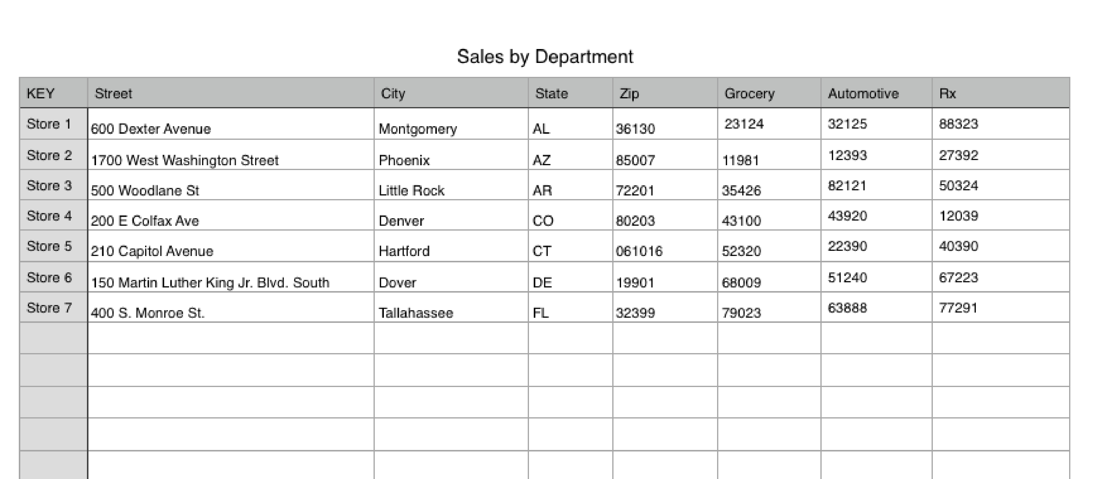
Here’s an example of a spreadsheet that’s been formatted for a geocoded location with multiple metrics. In this fictional example, we’ve listed seven retail stores, their addresses, and sales data for three departments: Grocery, Automotive and Prescriptions. We’ll be using the Store Number as our Key Field.
2. Copy the addresses and header row
After formatting your data, you’ll need to select the addresses and data you want to pin to your map, Be sure to copy the header row (the row on your spreadsheet with Key, Street, City, etc.)

3. Create Map or Add Dataset to Existing Map
If you have not yet created the map to which you wish to pin the addresses you copied in Step 2, do so now.
a. From the Dashboard: Select “+ Create a New Map”.
b. Give your map a name: Enter a name for your map in the appropriate field and provide a brief description if desired. Click Next.
c. Select geography type: Choose Specific Address / Drop Pin. Click Next.

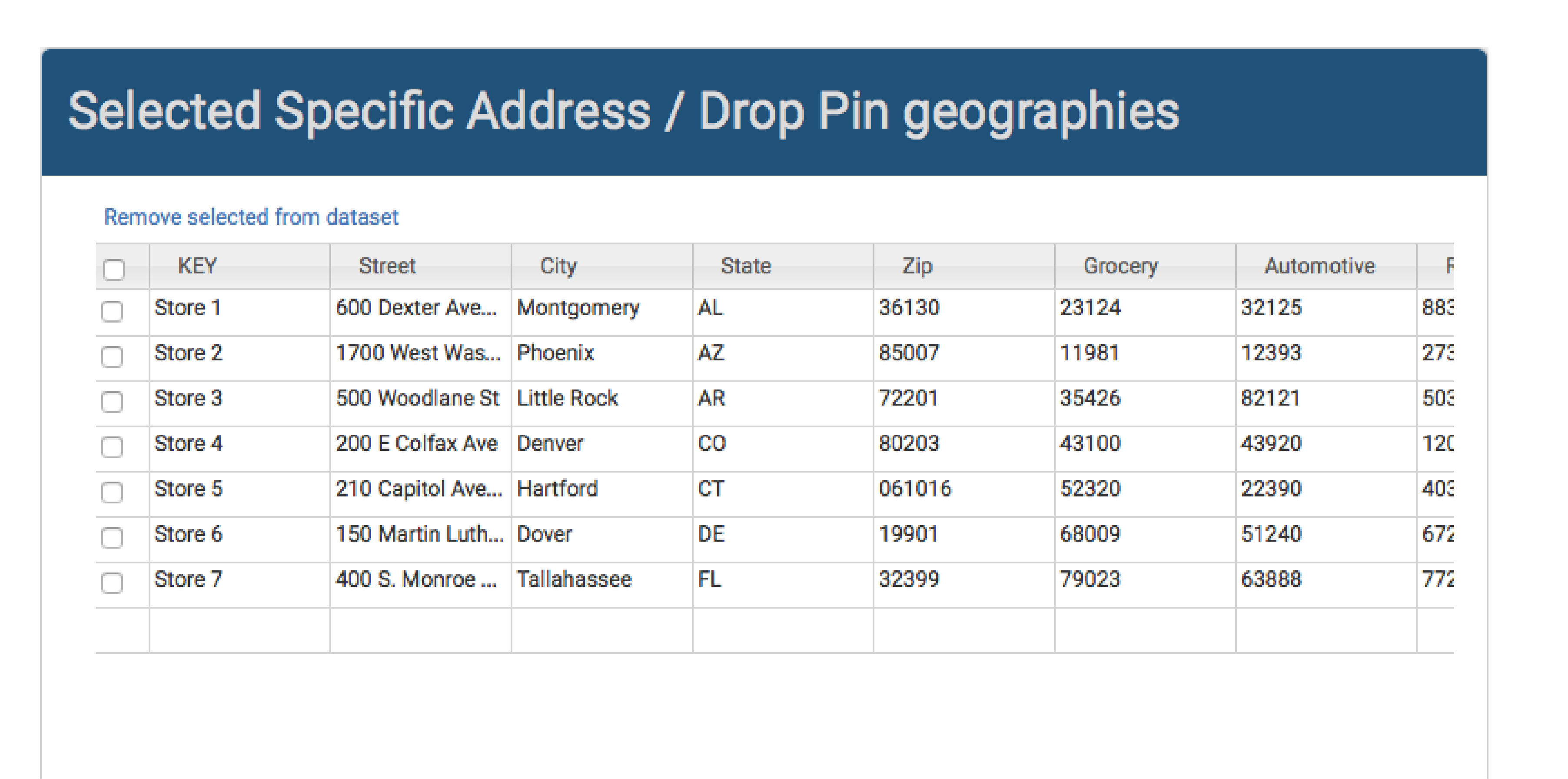
d. Selected Specific Address / Drop Pin geographies: Place cursor in the cell beneath the “A” column header.

e. Paste data: Paste data into the FactLook Wizard. The header row will automatically update with the header row and data from your spreadsheet. Click Next.
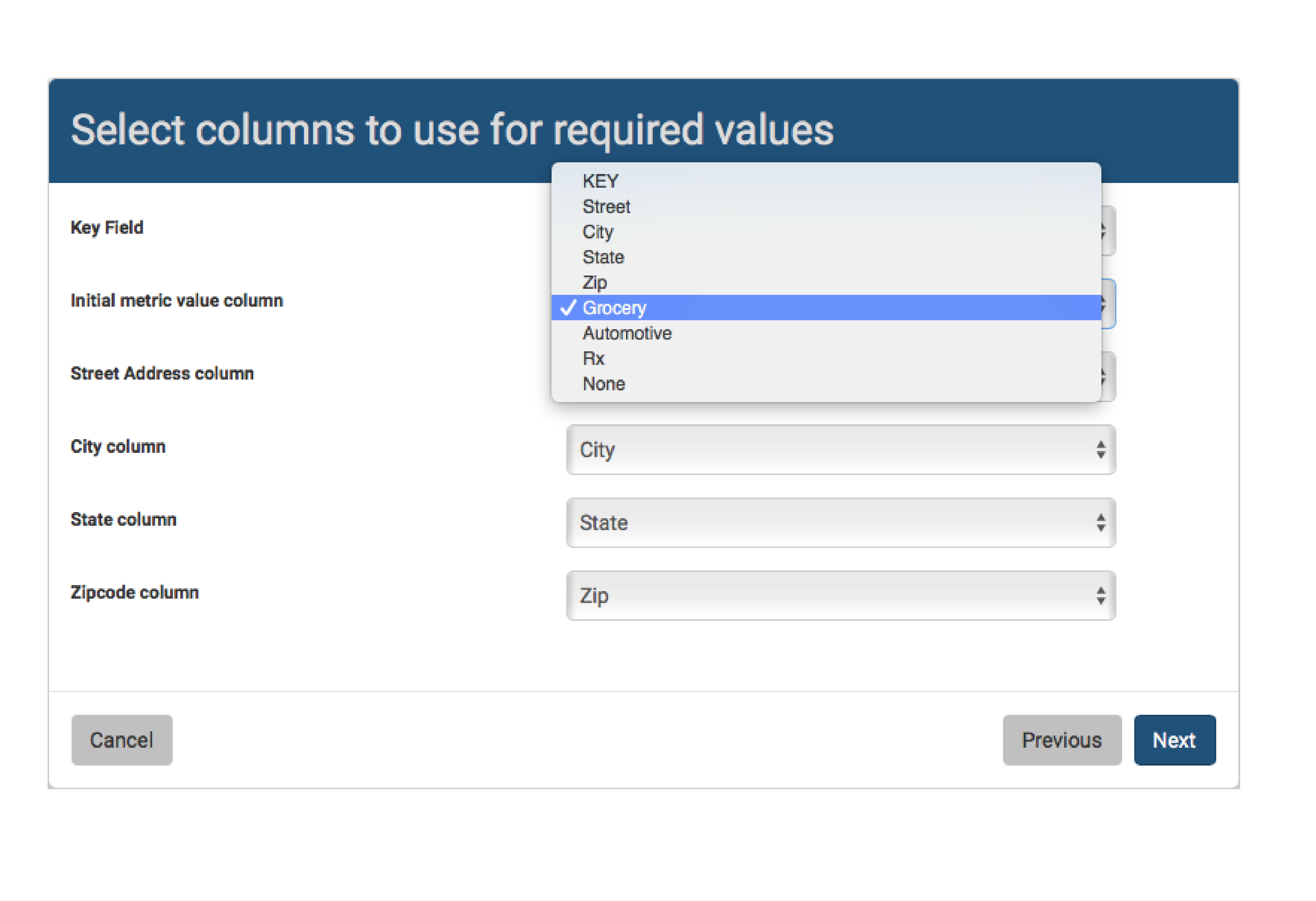
f. Select columns to use for required values: Help the FactLook Wizard identify which columns of data to use in order to place your pins. Choose one of the metrics you’d like to display (you will add the additional metrics in later steps). Click Next to view your map.
4. Adding Additional Metrics
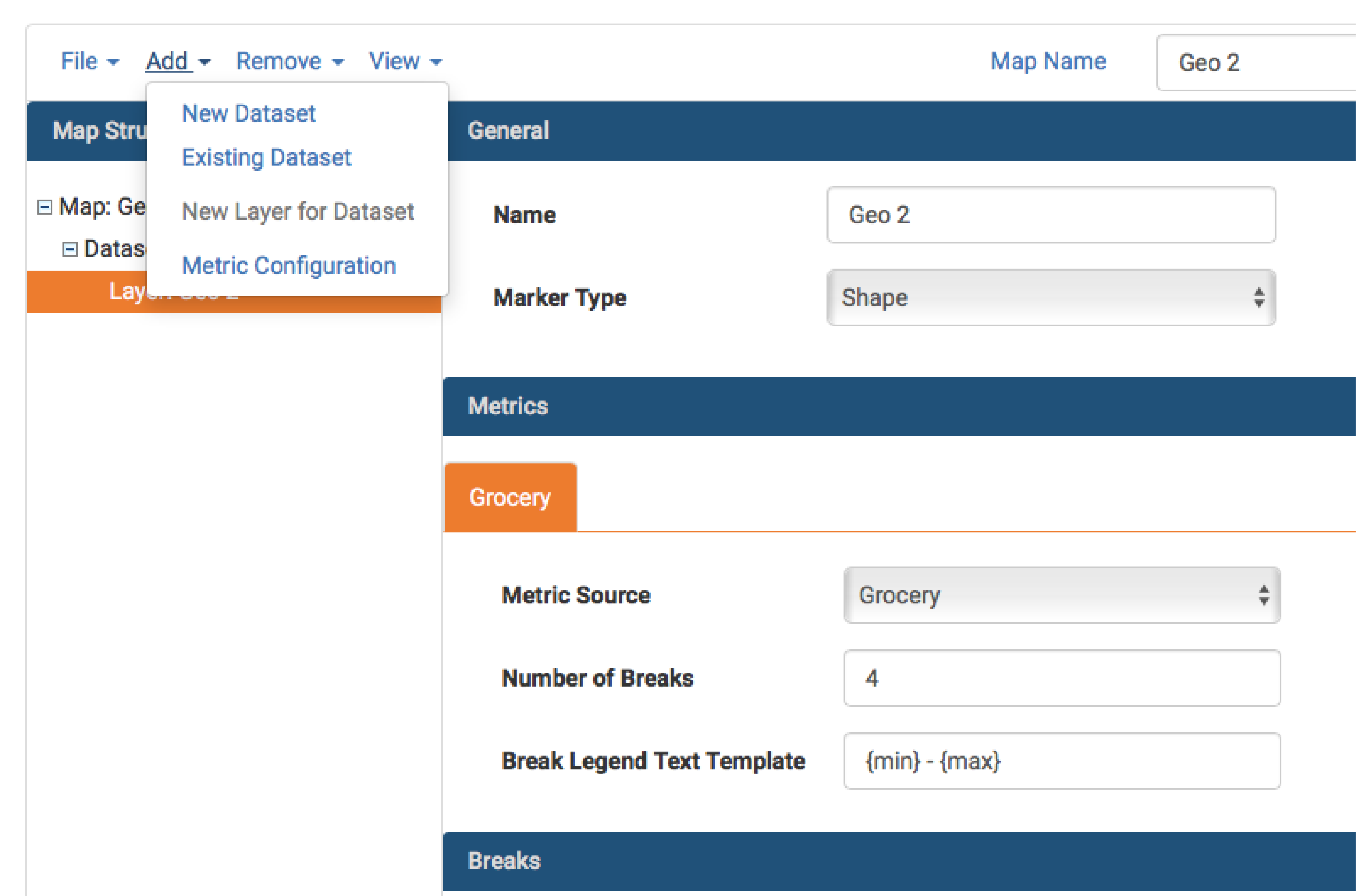
a. After clicking Next in the previous step, your map will display a single metric. To add additional metrics, from the Layer view, select “Add” > “Metric Configuration”.
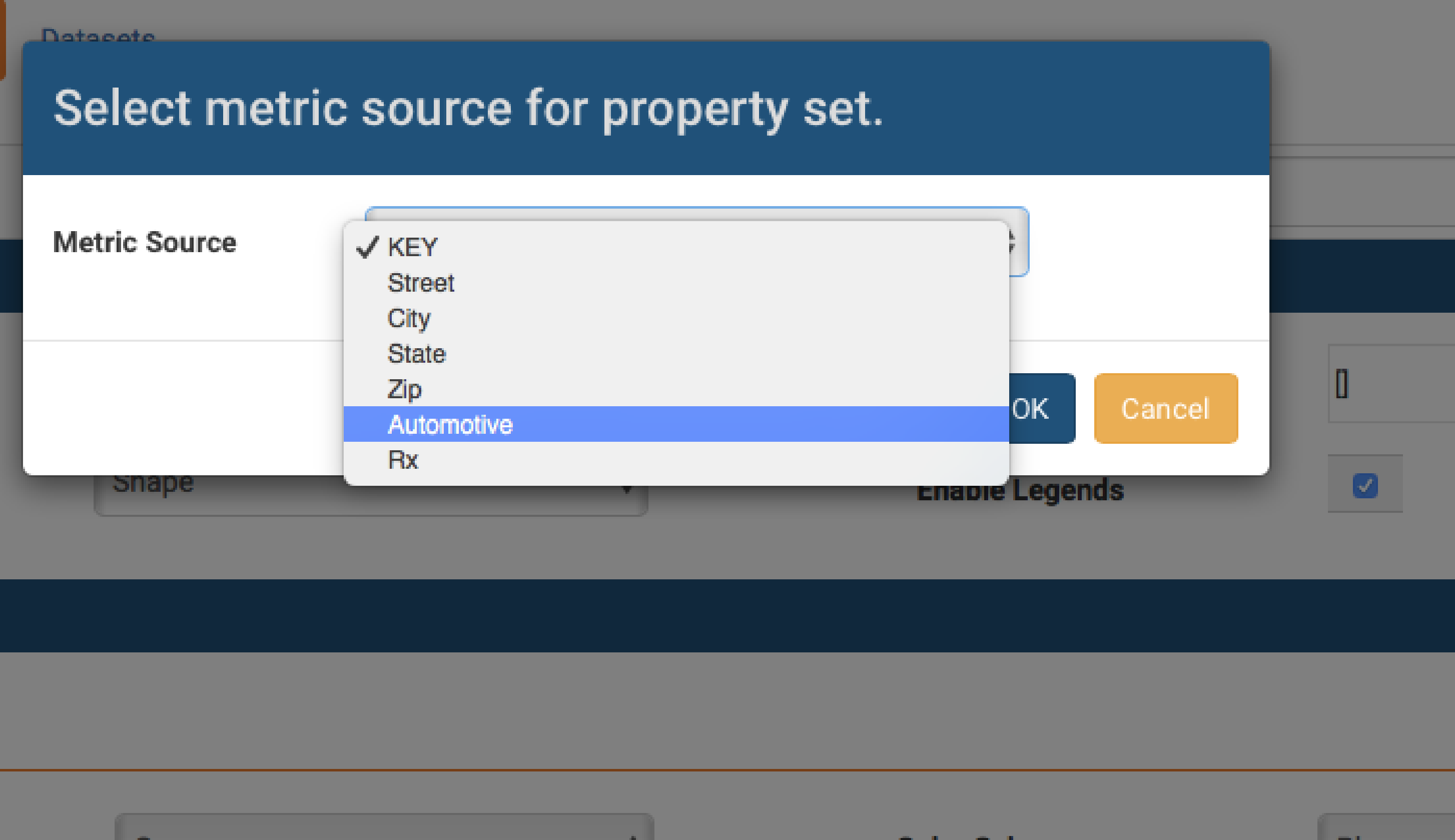
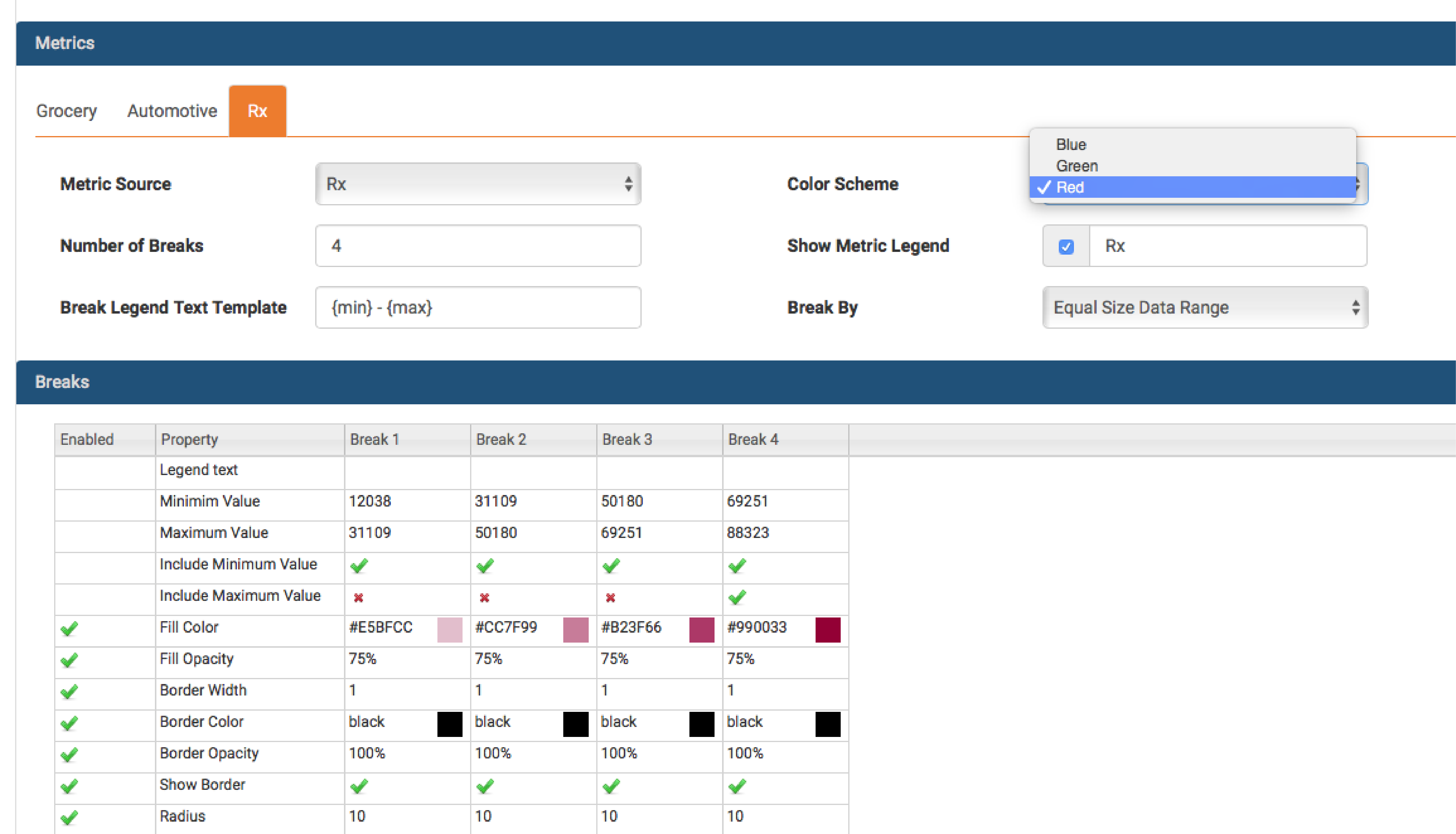
b. A new window will open. From the drop down menu, select the additional metric value you wish to add to the marker. Only values that have not previously been added to the marker will be displayed.
c. A new tab will appear in the Metrics panel in the Layer view. Adjust colors and other styles for this metric using the selectors in the Breaks panel.
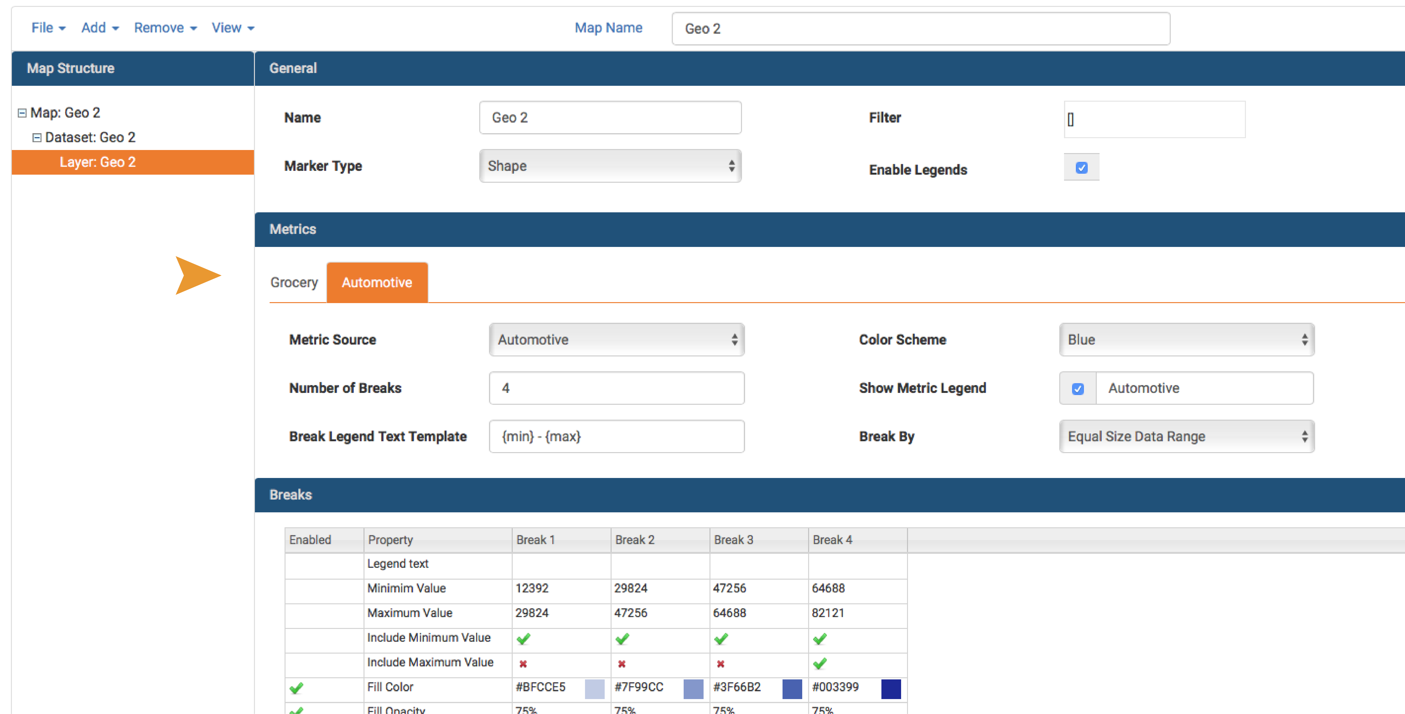
d. Add additional metrics using the same procedure as above. Assign a unique color palette to each metric set.
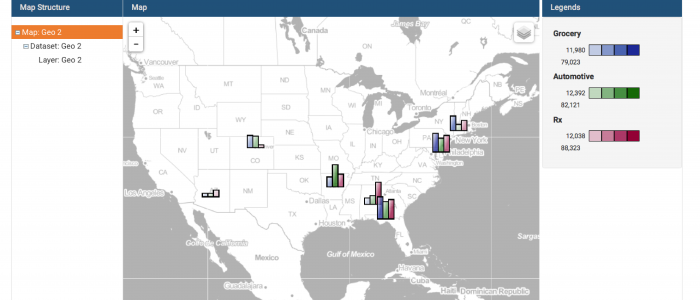
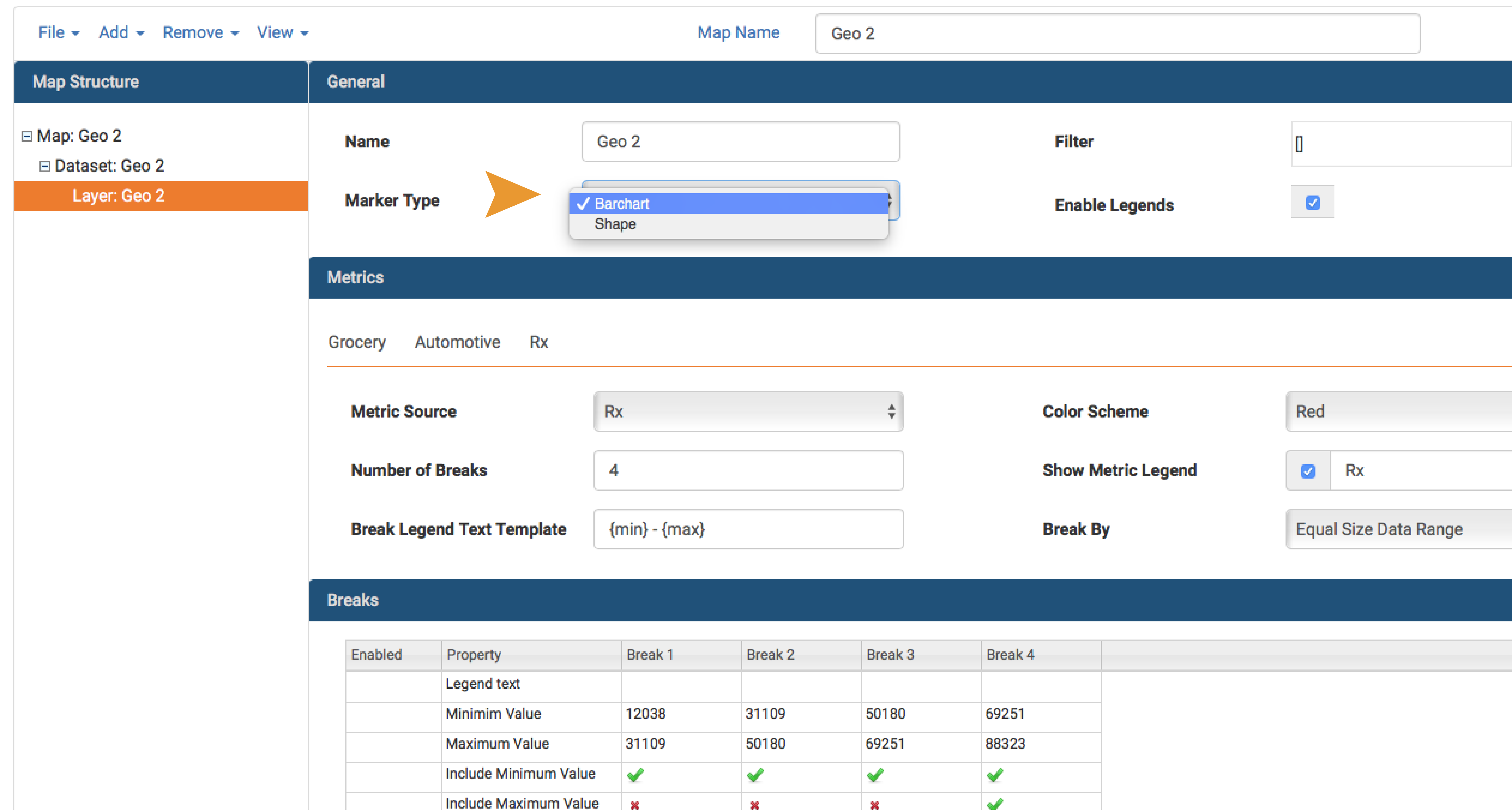
e. In the General panel, change the Marker Type to “Barchart”.
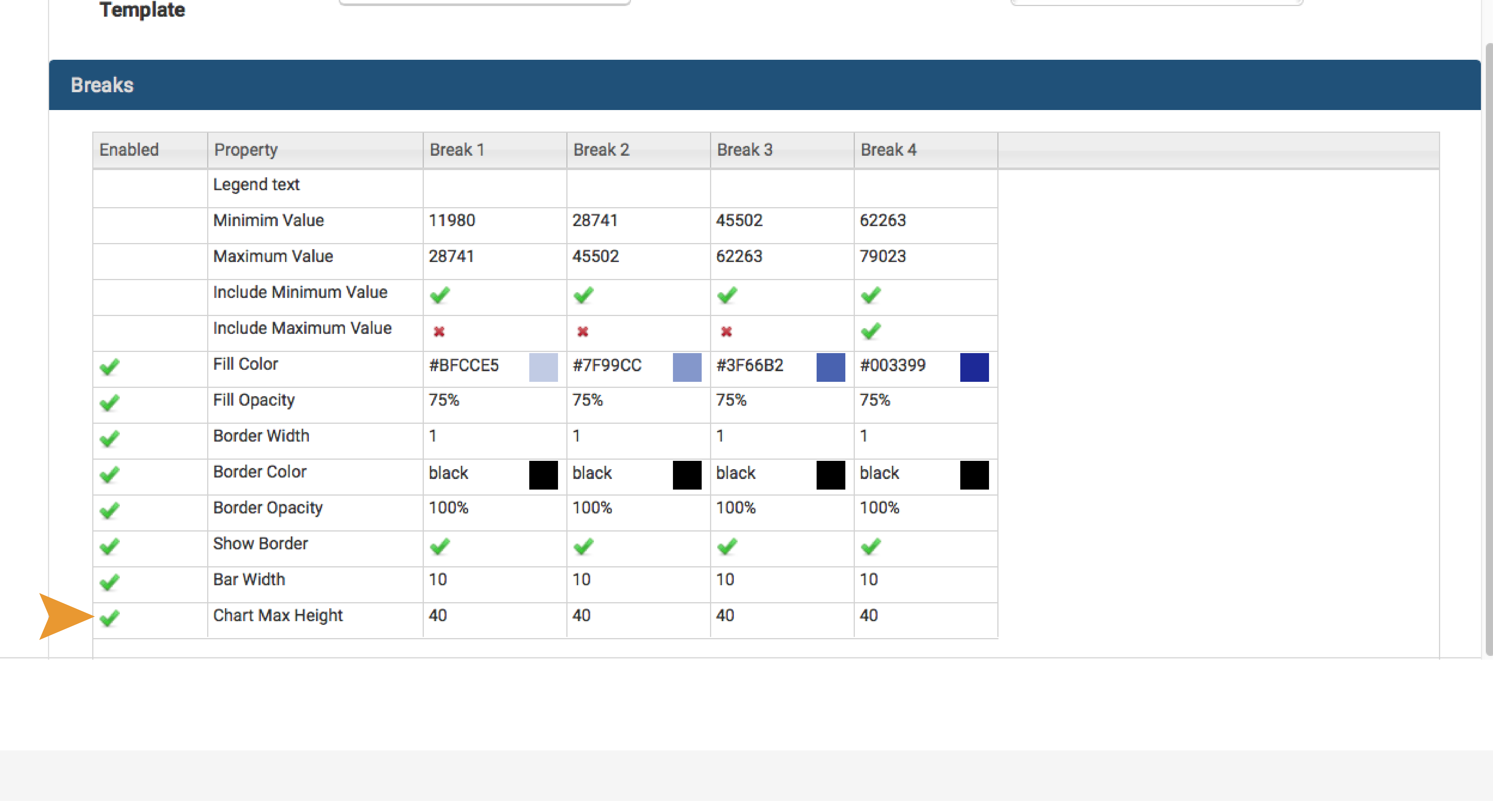
f. In the Breaks panel, set the bar height and width to suit your preferences.
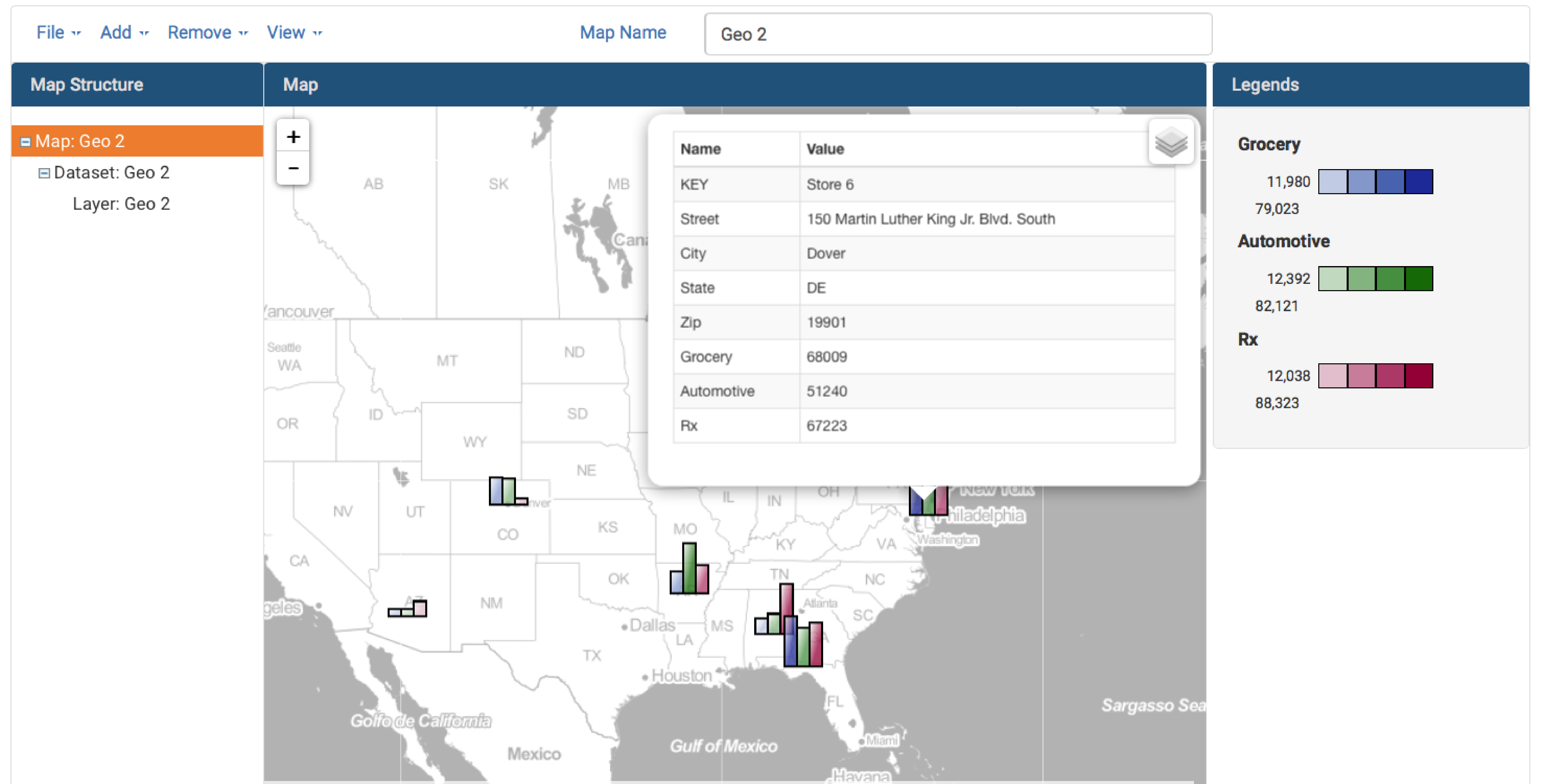
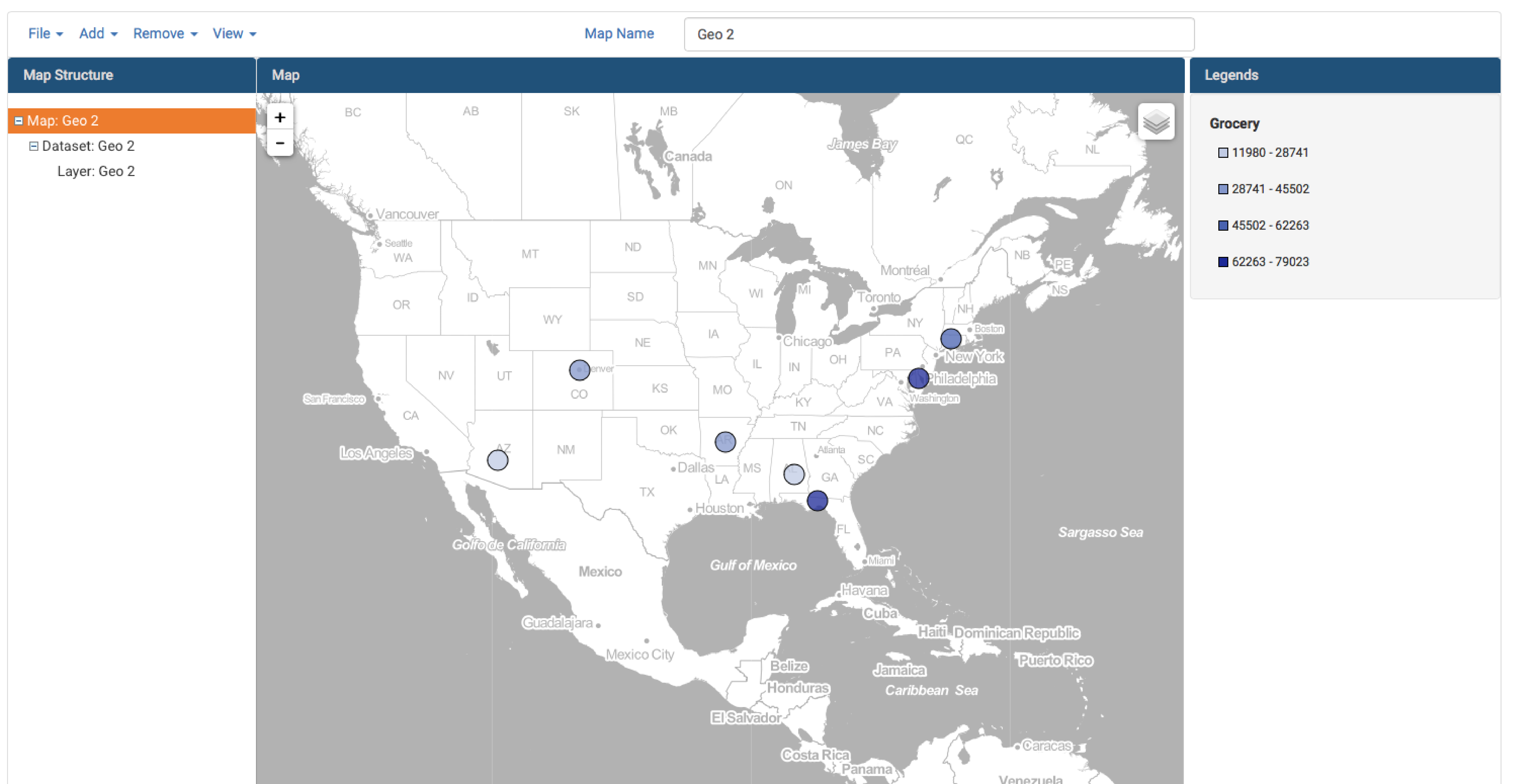
g. Go to Map view to see your changes.
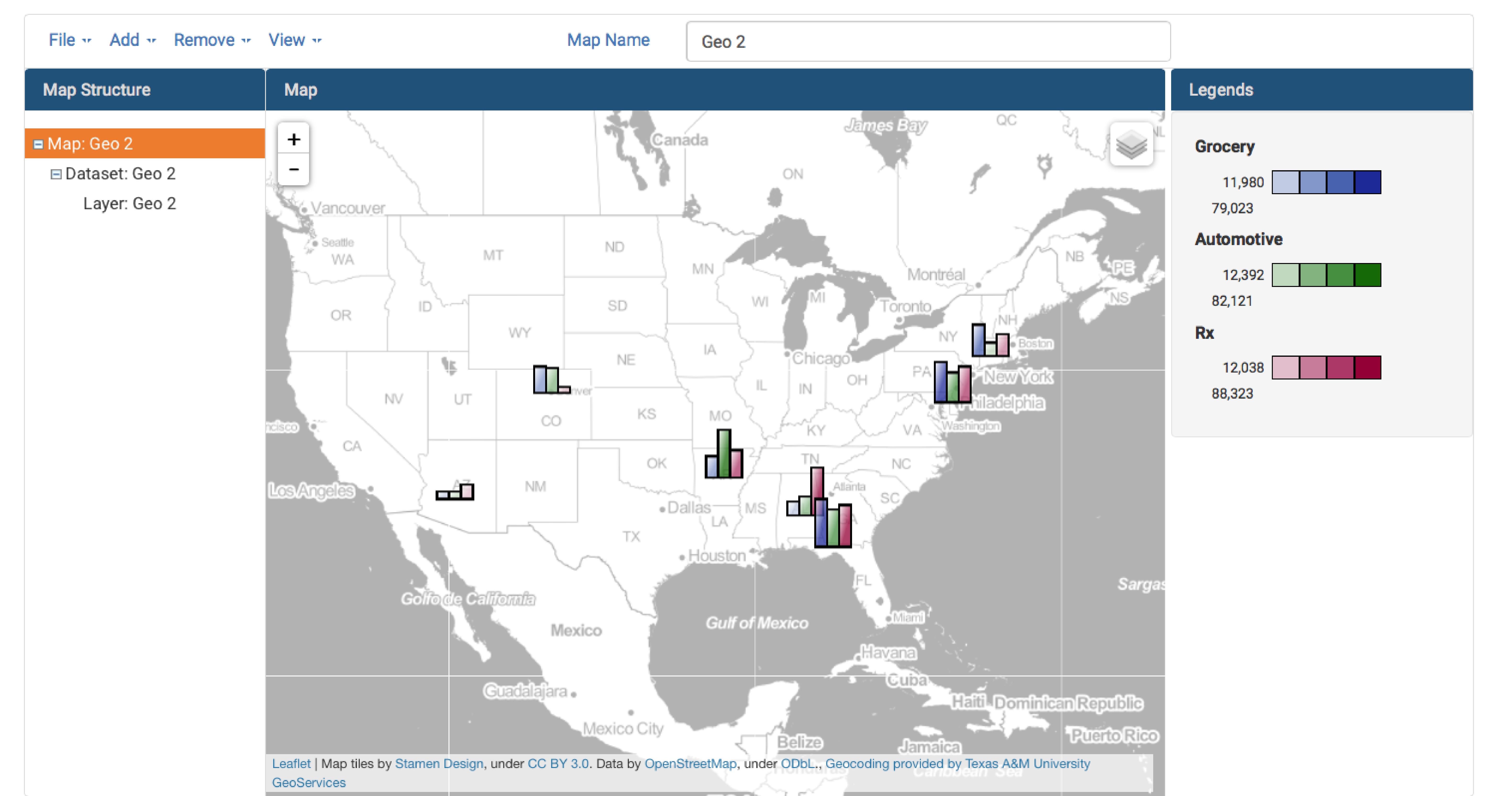
h. Click on one of the geocoded bar charts to view all metrics associated with that marker.