This video tutorial shows how to use FactLook’s geocoding features.
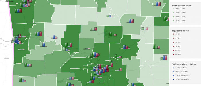
Census tract map with geocoded bar charts
We wanted to display how well certain product categories were performing at a fictitios multi-store grocery chain. First we created a census-tract layer displaying owner-occupied home data (maker shades of blue indicate heavier ownership). We then used FactLook’s geocoding feature to pin every store’s location on the map, then used bar charts to show sales […]
State map showing regions with geocoding
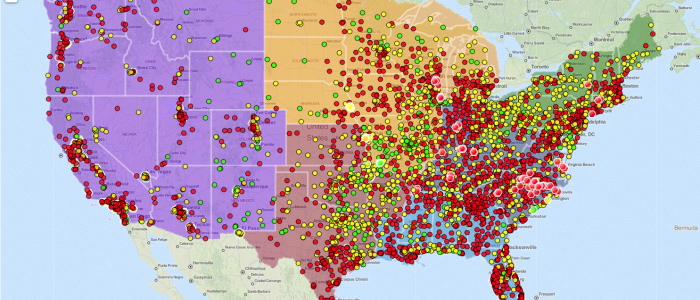
This map displays data about a fictitious grocery outlet. The first layer organizes the US states into different regions (West, South, etc.). The geocoded layers display each stores revenue: three breaks, ranging from red (low) to yellow (medium) to green (high). The hexagon markers represent specialty food stores participating in a pilot program to test validity.
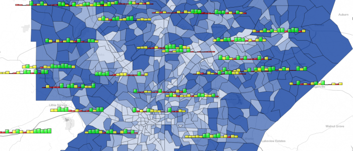
County map using bar chart to display income, sales and population demos
Arkansas map, showing median household income by county (green shading). Then the multiple-metric bar chart markers are showing grocery category sales for each store of a fictional retail chain along with population 65 years and older. The bar charts display a single metric (overall grocery sales) vs multiple-metric for individual category sales. The height of […]
Multi-State County Map with Geocoding and Bar Chart
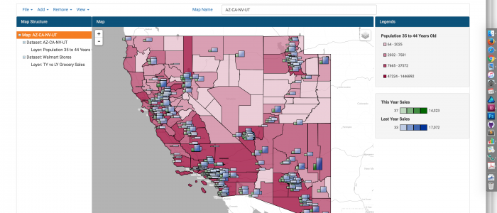
This multi-state map was created to display multiple metrics using FactLook’s bar chart feature.
County Map with Geocoding
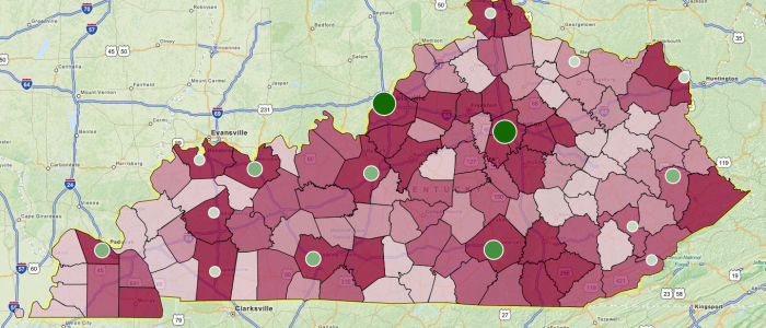
This map was created to show the unemployment rate by county in Kentucky with geocoded locations of several community colleges displaying enrollment rates. Map was used to display correlation between unemployment and location of affordable schools.