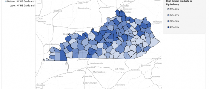
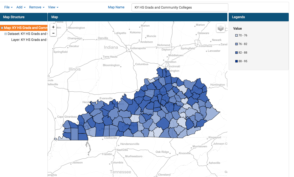
In this step-by-step tutorial, we’ll show you how to create a basic area-based map using a single metric. For this example, we’ll be building a map that has data for all counties in the state of Kentucky. The steps presented would be the same for any of the other area-map choices FactLook offers. Above is the finished map. Here is a link to the raw data we used in case you want to follow along.
1. Format your spreadsheet:
Before building a thematic map with FactLook, it’s important to first make sure that your data is formatted so that your rows of data match those in the FactLook wizard.
In our example of building a map displaying data for all 120 counties in the Commonwealth of Kentucky, the FactLook wizard displays the counties in alphabetical order. If your spreadsheet is not organized with the counties in alpha order when you paste the column of data you copied from your spreadsheet into the FactLook wizard, you’ll end up with data that’s not in synch with its county.
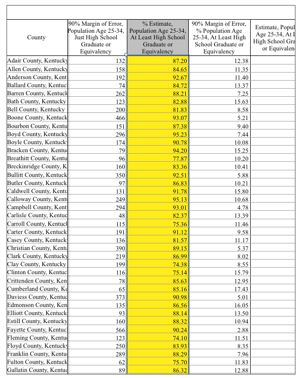
Here’s an example of a spreadsheet that’s been formatted in alphabetical order for proper importing into the FactLook wizard. The data we’ll be displaying on our map is highlighted.

2. Create Map or Add Dataset to Existing Map
If you have not yet created a map in the FactLook wizard, do so now.
a. From the Dashboard: Select “+ Create a New Map”.
b. Give your map a name: Enter a name for your map in the appropriate field and provide a brief description if desired. Click Next.
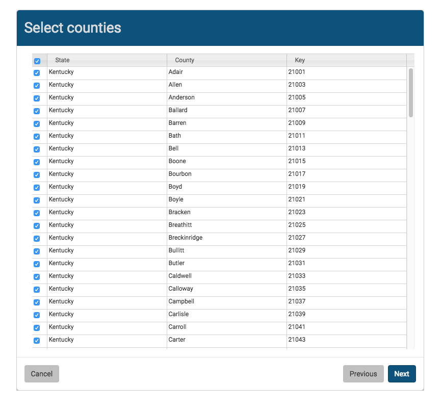
c. Select geography type: Choose “County”
d. Select counties: Tick the box in the upper left to select all counties, or select the individual counties that you wish to display.
e. Copy data on your spreadsheet: Copy the values you wish to import into the FactLook wizard. Remember to double-check that your spreadsheet is formatted to match the FactLook wizard formatting.
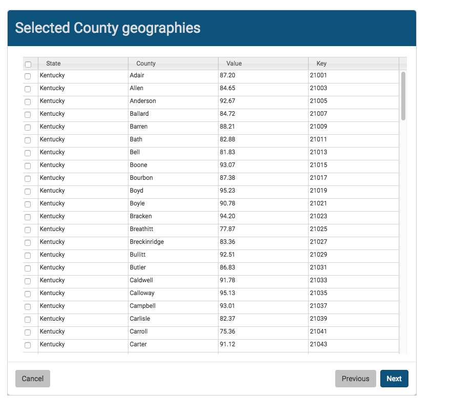
f. Paste data: In the FactLook wizard, drop you cursor in the first blank cell in the Value column and paste. Here is what you will see after pasting in your data.
g. Click “Next” to generate your map.
By default, your map will generate using FactLook’s default style settings:
- Blue color scheme
- Four breaks (Breaks are the groupings of your data to illustrate differences between segments of data.)
- Breaks organized by Equal Size Data Ranges
To change these default styles, proceed to Part 2 of this tutorial.